Imagine two college professors going at it nose to nose.
One is American, the other British. The one from the USA is wearing black and white. The chap from England is wearing a multicolored jacket. “Black and white has the greatest contrast!” Swish…”It depends on many factors!” Nose to nose…toe to toe. Yelling so loud that they’re unintelligible.
What’s the argument? Does the color of print and its background color affect successful reading for students with dyslexia. Who wins the argument?
The recent research says that there are many color combinations, which impact readability for the dyslexic child. It also dependent upon the quality of print and paper. Computer research allows greater accuracy due to programming design.
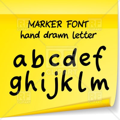
The closest to concensus is black print on yellow background. Next is blue print on white background.
Let the battle continue.


Leave a Reply